Civ 7 UI: Bad or Misunderstood?

Civ 7’s Deluxe Edition has been out for just a day, and already the online community is buzzing with critiques, particularly about its user interface (UI). But is the UI really as bad as some claim? Let's dive in and analyze the game's UI elements to see if it lives up to—or down to—the hype.
← Return to Sid Meier's Civilization VII main article
Is Civ 7's UI as Bad as They Say?
Civ 7 has been available for just a day for those who purchased the Deluxe and Founder’s Editions, and it's already facing criticism, especially regarding its UI and other missing quality-of-life features. While it's easy to join the chorus of detractors, it's important to take a step back and critically evaluate whether the UI is truly as problematic as claimed. The best approach is to analyze it component by component and determine if it meets the standards of an effective 4X game interface.
What Makes a Good 4X UI?
Defining a good 4X UI is nuanced, as design principles can vary depending on the game’s context, style, and objectives. However, experts have identified common elements that tend to work well across many 4X games. Let's assess Civ 7’s UI against these key criteria.
Clear Information Hierarchy
A clear information hierarchy ensures that the most important and frequently used data is easily accessible. In 4X games, this means placing key resources and mechanics front and center, with less critical features a few clicks away. A well-designed UI organizes information logically, making it intuitive for players.
For instance, Against the Storm's building info menus exemplify this principle. When a building is selected, a pop-up menu allows players to adjust its parameters, organized into tabs based on usage frequency. The default tab includes common actions like worker assignment and production settings, while other tabs contain less-used features like inventory management.
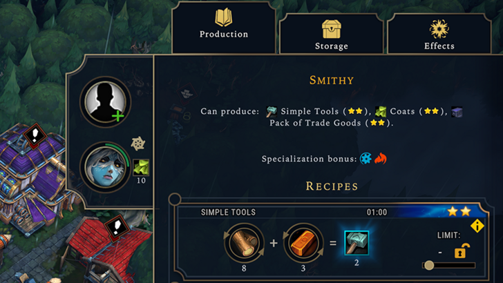
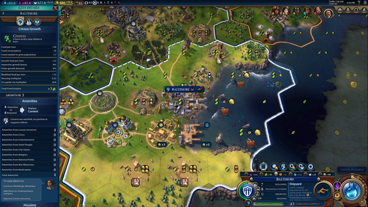
Civ 7's resource rundown UI is functional but could be more effective. The summary menu shows resource allocation across your empire, with dropdowns for income, yields, and expenses. It's well-organized, but lacks detail on specific resource sources and a comprehensive expense breakdown. While not ideal, it's far from useless.
Effective and Efficient Visual Indicators
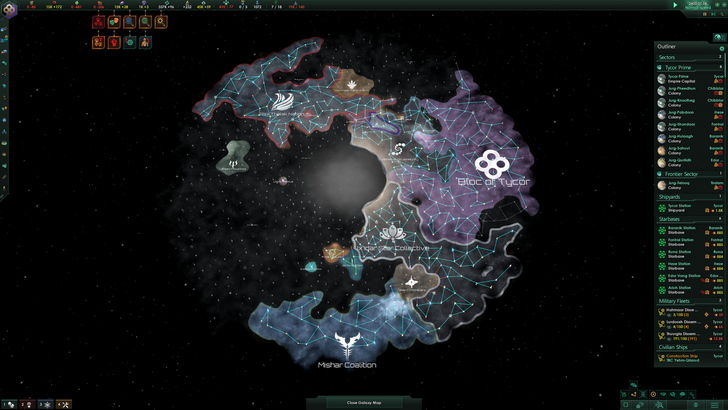
Visual indicators like icons and color coding should convey information quickly and clearly. Stellaris' Outliner is a great example, using icons to show the status of survey ships and colony needs at a glance.
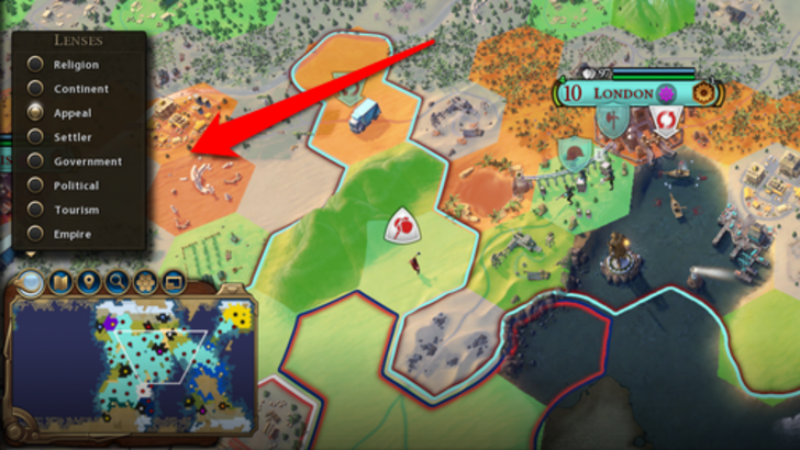
Civ 7 uses iconography and numerical displays for resources, supplemented by visual indicators like tile yield and settlement overlays. While some players miss certain lenses from Civ 6, Civ 7's visual indicators are generally effective, though there's room for improvement.
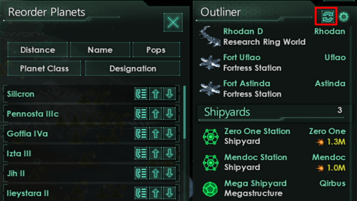
Searching, Filtering, and Sorting Options
As 4X games grow in complexity, search, filter, and sort options become crucial for managing information. Civ 6's search function is a standout, allowing players to find resources and features across the map easily.
Civ 7, however, lacks this search function, which is a significant drawback given the game's scale. Hopefully, future updates will address this and enhance the Civilopedia's functionality.
Design and Visual Consistency
A UI's design and visual consistency are vital for player engagement. Civ 6's UI, with its cartographical style, complements the game's aesthetic beautifully.
Civ 7 adopts a more minimalist and sophisticated look, using black and gold tones. While this aligns with the game's regal theme, it's less visually striking, leading to mixed reactions. Visual design is subjective, but Civ 7's UI, while not visually forward, is still professionally executed.
So What’s the Verdict?
It’s Not The Best, But Undeserving of Such Disapproval
After analyzing Civ 7's UI against these criteria, it's clear that while it's not the best or most refined, it's not as bad as some claim. The missing search function is a notable flaw, but overall, the UI's issues are minor compared to other aspects of the game. While it may not match the visual appeal and efficiency of other 4X UIs, it has its strengths.
Personally, I find Civ 7's UI acceptable. The game's strong gameplay compensates for its UI's shortcomings, and with future updates and player feedback, it could improve further. In my opinion, the criticism is overblown.
← Return to Sid Meier's Civilization VII main article
Sid Meier's Civilization VII Similar Games


-
1
![Roblox Forsaken Characters Tier List [UPDATED] (2025)](https://imgs.ksjha.com/uploads/18/17380116246797f3e8a8a39.jpg)
Roblox Forsaken Characters Tier List [UPDATED] (2025)
Mar 17,2025
-
2
Roblox UGC Limited Codes Unveiled for January 2025
Jan 06,2025
-
3

Stardew Valley: A Complete Guide To Enchantments & Weapon Forging
Jan 07,2025
-
4

Pokémon TCG Pocket: Troubleshooting Error 102 Resolved
Jan 08,2025
-
5

Free Fire Characters 2025: Ultimate Guide
Feb 20,2025
-
6
Roblox: RIVALS Codes (January 2025)
Jan 07,2025
-
7
Blood Strike - All Working Redeem Codes January 2025
Jan 08,2025
-
8
Delta Force: A Complete Guide to All Campaign Missions
Apr 09,2025
-
9

Blue Archive Unveils Cyber New Year March Event
Dec 19,2024
-
10
Cyber Quest: Engage in Captivating Card Battles on Android
Dec 19,2024
-
Download

A Simple Life with My Unobtrusive Sister
Casual / 392.30M
Update: Mar 27,2025
-
Download
![Corrupting the Universe [v3.0]](https://imgs.ksjha.com/uploads/66/1719514653667db61d741e9.jpg)
Corrupting the Universe [v3.0]
Casual / 486.00M
Update: Dec 17,2024
-
Download

Ben 10 A day with Gwen
Casual / 47.41M
Update: Feb 24,2025
-
4
Random fap scene
-
5
Oniga Town of the Dead
-
6
Cute Reapers in my Room Android
-
7
A Wife And Mother
-
8
Permit Deny
-
9
My School Is A Harem
-
10
Utouto Suyasuya